Restaurant vs cafe vs coffee shop social media tips
April 18, 2026 · 12 min read
Three types of food and beverage brands. Three different customer relationships. Three entirely different jobs for social media to do.
Most operators in this space treat them the same: product photos, the occasional behind-the-scenes shot, a seasonal special when something comes in. That covers some of the work. It doesn't cover the specific thing each vertical is actually trying to accomplish, and the gap is where the feed goes flat.
A restaurant's social account is doing a fundamentally different job than a cafe's. A cafe is doing a fundamentally different job than a coffee shop. Get those jobs confused and you ship beautiful content that moves no one in any particular direction.
This post maps the five content patterns that work for each vertical, with the specific brand examples to make the patterns concrete: Larkspur for restaurants, Bluebird for cafes, Common Grounds for coffee shops. Then three cross-applicable lessons that any food and beverage brand can run regardless of where they sit.
The goal is a clear answer to the question: "What should I actually post?" It depends entirely on which job your brand is trying to do.
Restaurants: the job is to drive a reservation
A restaurant's social feed is a conversion tool disguised as a content feed. Every post exists to make someone think "I want to sit at that table." Aspiration is the lever. Information is secondary.
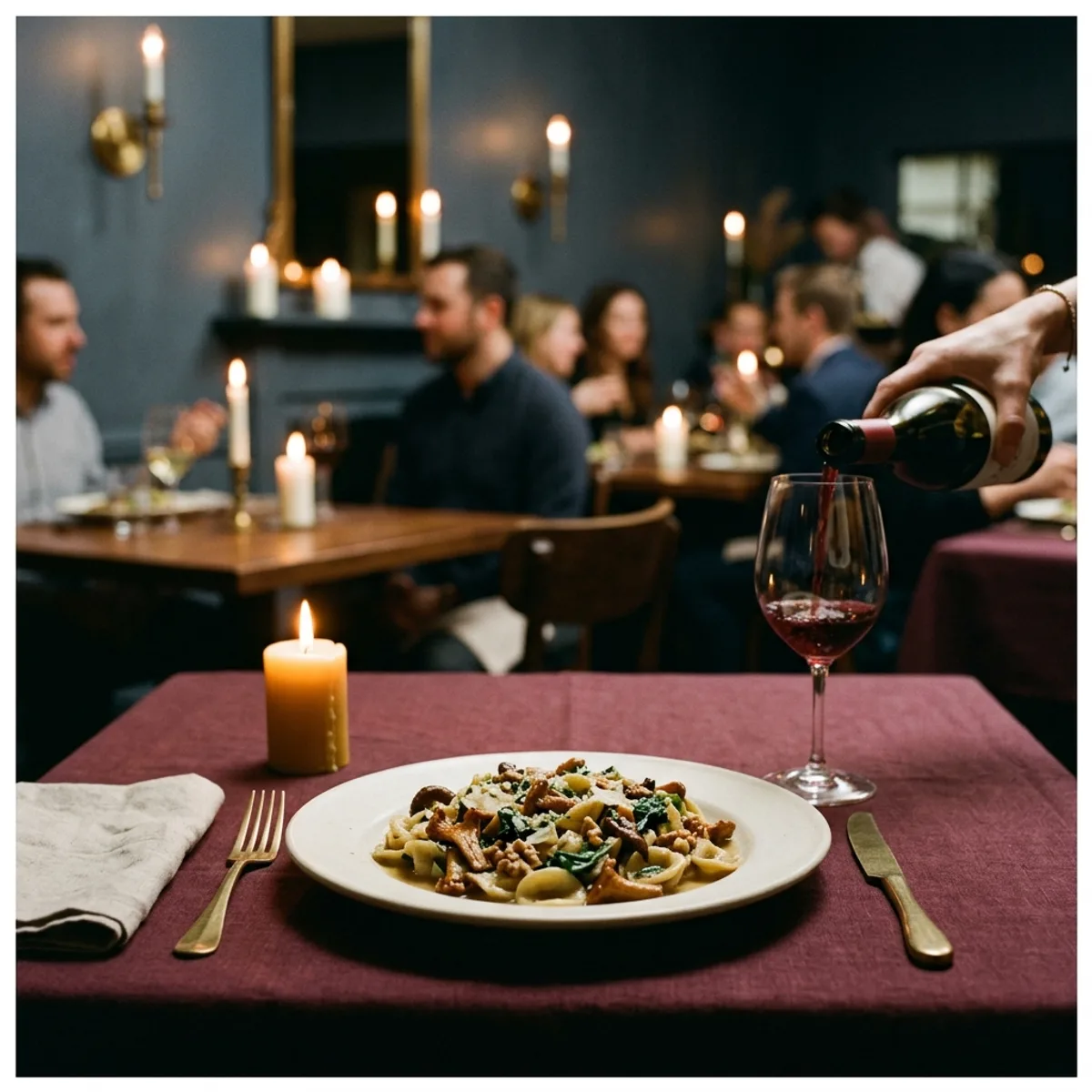
Larkspur is the working example: a 60-seat fine-casual restaurant with a prix-fixe leaning, brass fixture lighting, deep burgundy linens, and a chef who trained in France but cooks in a mid-sized American city. The brand is premium without being precious. The food is technically serious but the room is warm.
Here are the five content patterns that work.
Chef's-table content. The chef at the pass, not smiling for the camera but working. A knife moving through a shallot. A sauce tasting with a spoon held up to the light. This is the content that signals seriousness without announcing it. The caption can be short: "Larkspur, Friday, 7pm. Three seats left at the chef's counter." The image does the heavy lifting.
Dish hero. One dish, photographed with intent. Ironstone plating, a single garnish, dramatic shadow, the table's linen visible at the edge of the frame. The mistake here is over-lighting. A restaurant dish hero should feel like low candlelight, not a studio strobe. The aspiration is "I want to taste that," not "that looks technically impressive." Larkspur's signature pasta: hand-rolled, bronze-die extruded, three-ingredient sauce, shot in available candlelight with a soft background of the room. No overhead angle. At the table, like a guest would see it.
Menu reveal. A new seasonal dish or a returning menu item gets its own post. The format: a close frame on the dish, a caption that tells the story of the ingredient rather than the dish itself. "The first ramps of the season came in Tuesday from a farm forty miles north. They'll be on the menu through April." The dish is the vehicle; the sourcing story is the reason to care.
Behind the pass. This is not behind-the-counter content in the casual sense. For a restaurant, this is the controlled peek: the mise en place at 3pm, the full brigade in their whites just before service, the pastry station at 7am. The subject is the discipline, not the warmth. It answers the unspoken question: "Is this place serious?" Yes. Here is the evidence.
Special-occasion drives. Valentine's Day. A birthday prix-fixe. The chef's decade anniversary menu. These posts have a direct conversion goal and should say so: "Six seats remain for the February 14th chef's counter. Reservations open now." A link in bio. No coyness. Restaurants that hedge on these lose the booking.
The common thread across all five: aspiration over information. Larkspur's feed should make someone feel slightly underdressed before they've even read the caption. That's the target.
Cafes: the job is to sell a third-place feel
A cafe's social account is not selling coffee. It's selling belonging. The customer's unspoken question is "Is this a place where someone like me could spend two hours on a Tuesday?" The content answers that question before they've walked through the door.
Bluebird is the working example: a neighborhood cafe with a long reclaimed wood bar, brass espresso fixtures, north-window light, and a regulars culture that took three years to build. The brand is unhurried and specific. Navy ceramic cups. An oat linen apron aesthetic. A barista named Carmen who has been at the bar for four years.
Here are the five content patterns that work.
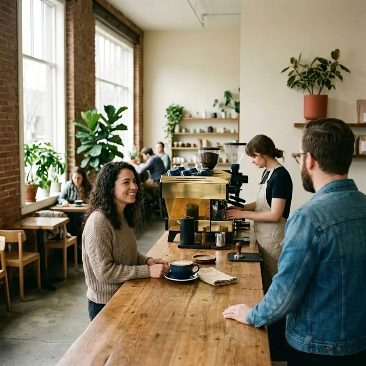
Ambient regulars. A customer at the bar, cradling a navy ceramic cup, a paperback open face-down beside them. Not posed. Not looking at the camera. This is the single most powerful content type a cafe can ship, and most cafes never ask a regular if they can photograph them. Ask. One good ambient regular shot compresses the entire brand identity into a single image: "this is what it feels like to be here."
Barista craftsmanship. Carmen pouring a rosetta. The espresso pull, the milk stretch, the tamp. These are not the same as restaurant behind-the-counter content, which signals discipline. Barista craftsmanship content signals care. The distinction is subtle but real. The restaurant version says "we take the work seriously." The cafe version says "the person making your drink is invested in the result." Same general category, different emotional register.
Lifestyle moments. A laptop open beside a cup, a hand reaching for a biscotti, two people mid-conversation across a small table. The cafe is the background, not the subject. This is the content that drives saves because the image answers "is this place for me?" without requiring any words at all. Keep the caption light: "Tuesday morning, north window." That's it.
Slow content. Steam rising from a cup. A milk pitcher settling after a pour. A door open to the sidewalk on a spring morning. These posts don't explain themselves and don't need to. They are a palette cleanser in the feed, a breathing room between the more informational posts. They signal that the brand is confident enough not to always be selling.
Neighborhood. The sidewalk planter that Carmen waters every morning. The chalk sign on the board outside. The view from the corner table during the first snowfall. A cafe's feed should feel like it lives somewhere specific, in a real neighborhood, with a real personality. Generic cafe content could be anywhere. Bluebird's content is Bluebird's block. That specificity is what builds the regulars culture in the first place.
The common thread across all five: belonging over transaction. Bluebird's feed should make someone feel like they already know the place before they've visited. When they finally walk in, the reaction should be "exactly what I expected," not "this is different from what I thought."
Coffee shops: the job is velocity
A coffee shop's social account is solving a morning problem. The customer's question is "can I trust this place to give me what I need, quickly, consistently, without drama?" The content answers that question with evidence.
Common Grounds is the working example: a counter-service coffee shop with white subway tile, a coral neon sign, a drive-thru lane, and a morning rush that runs 6 to 9am at full capacity. The brand is cheerful without being precious. Speed is a feature, not a shortcoming. A loyalty program with 4,200 active members. A daily special that rotates every Monday.
Here are the five content patterns that work.
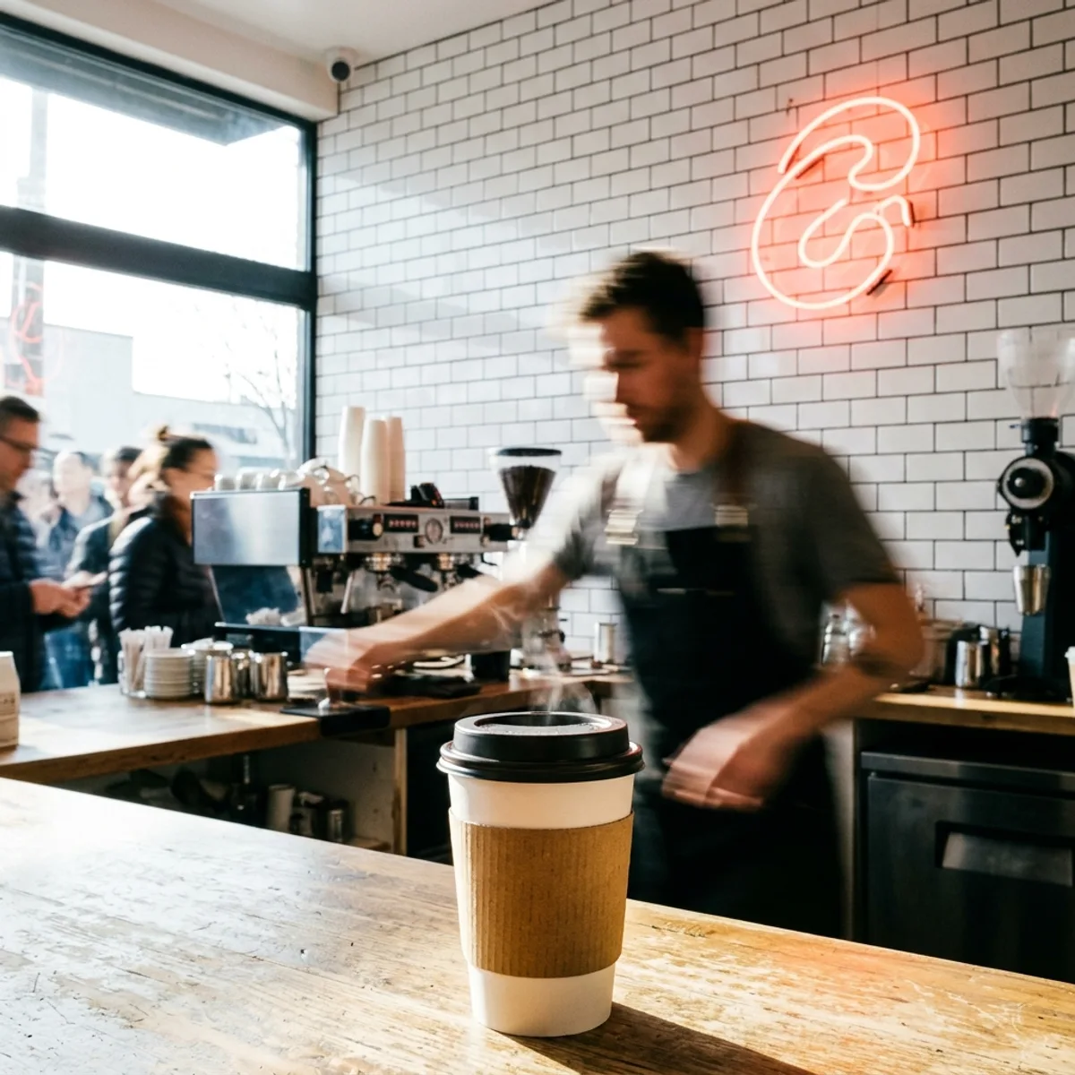
Speed-of-service content. A timelapse of the morning rush. A barista handling three drinks simultaneously. The line moving. This sounds counterintuitive as marketing because you're showing the busiest, most hectic version of the business. That's the point. "We can handle this" is a direct answer to the customer's fear: "if I go during rush hour, will I wait forever?" Common Grounds posts a 15-second rush video every other Thursday. It is consistently their highest-reach content.
Morning rush energy. A kraft sleeve cup in hand, a car door, the first sip in the driver's seat at 6:47am. Not the cafe. Not the interior. The customer in their morning, with Common Grounds in it. The visual register is motion and light, not stillness. This is the opposite of Bluebird's slow content. Common Grounds' feed should feel like 6am, not 11am.
Drive-thru happy moments. A customer picking up through the window, a dog in the back seat, a sticker on the cup matching the car's color. These posts require a bit of operator attention (someone noticing the moment and having a camera handy), but when they land, they perform significantly above the average post. Toast's restaurant industry research consistently shows that user-moment content outperforms product photography for quick-service formats, often by a factor of 2 to 3 on saves.
Loyalty program visibility. "Punch card number 10: free drink. Claimed by 214 people this month." A post about the program is not an ad for the program. It's social proof that the program is real and used by real people. Common Grounds posts a monthly loyalty update with a count of rewards claimed. The post reads like a community update, not a promotional announcement. The distinction is important.
Daily specials. Monday's new special, photographed quickly, posted by 7am. The photo does not need to be elaborate. A kraft sleeve cup with the special's name handwritten on a card beside it. The format is consistent, the turnaround is fast, and the value is purely practical: a regular knows to check the feed on Monday morning to see what's new. That habit compounds. After six months, the Monday special post reliably gets the week's highest impressions because the audience has trained itself to expect it.
The common thread across all five: efficiency over atmosphere. Common Grounds' feed should make someone feel like they're in good hands during the hardest part of the morning. Not seduced. Not lingering. Equipped.
Three lessons that cross all three verticals
The job-specific patterns are the core of this. But three things work regardless of which vertical you're in, and they're worth running in any food and beverage feed.
The behind-the-counter job. Every vertical has a version of this content and every vertical underuses it. A chef at the pass, a barista with a pitcher, a counter crew moving through the rush. The reason to run it every week is simple: it turns a logo into a person. People follow people more readily than they follow brands. One behind-the-counter post per week is the minimum for any food and beverage account that wants to compound over a year rather than plateau at 400 followers. The specifics differ by vertical (discipline vs. care vs. competence), but the underlying mechanic is the same. For more on how this fits into a full weekly rotation, the seven content types post maps the full framework.
The specific time-of-day job. The most effective content for any food and beverage brand is time-anchored. "6:47am" does more work than "morning." "Friday, 7pm, three seats left" does more work than "come see us this weekend." Specific times tell the audience exactly when the brand is relevant to their life. Generic time language tells them nothing. This applies to captions, not just posts. Run a find-and-replace on your last 30 captions and replace every "morning," "evening," or "weekend" with a specific time. The posts will immediately feel more real.
The regulars-beat-heroes rule. The highest-performing post in most food and beverage feeds is not the beautifully produced hero shot. It's the photo of a regular doing a regular thing. The ambient customer at Bluebird. The loyalty punch-card photo at Common Grounds. The chef counter shot of a single diner at Larkspur. Regulars are proof that the brand is already working. Hero shots are promises. Regulars are testimonials. Run both, but understand which one is doing the heavier trust-building work. For a deeper look at what makes a brand feel consistent across its whole feed, what on-brand actually means covers the four axes: colors, voice, photography style, and cadence.
Which job are you optimizing for
Start there. Not "what should I post this week" but "what is my feed actually for?"
If the answer is reservations, the feed needs aspiration. Dish heroes, chef content, occasion drives. If the answer is belonging, the feed needs ambient regulars and slow moments. If the answer is velocity, the feed needs time-anchored energy and practical proof.
Most food and beverage operators mix all three without noticing, and the feed ends up doing none of them particularly well. Pick the job. Build the content around it. Let the other two jobs earn occasional posts when they genuinely fit.
The question of how to plan and batch that content once you know the job is covered in the weekly planning framework, which turns this kind of vertical analysis into a 60-minute planning ritual that runs every Monday.
More from the blog
7 types of branded social posts every business should rotate
Most small business feeds run two of seven possible content types. Here are all seven, what each one does, and a weekly rotation that uses the lot.
What does on-brand actually mean for social media content?
On-brand is not a vibe. It is four concrete axes: colors, voice, photography style, and cadence. Miss one and the feed feels off.
How to plan a week of social media posts in one sitting
A 60-minute weekly ritual that turns your content calendar from a daily stress point into a done-by-Monday system.